City of Overland Park.
Communications Intern · Summer 2026
In summer 2026, I served as a communications intern for the City of Overland Park. The team I joined handles communications, marketing, video, and graphic design for the entire city government, so the work spanned a wide range of the city’s communications.
All four projects demonstrate that range. I built a tool that produces print-ready business cards for city staff, created the branding and apparel for an employee event, designed new apparel for the Teen Council, and shot and edited a video to promote an exhibit on the city’s social channels.
OP Business Card Studio
A brand template, turned into a tool.
When a city employee needs business cards, the request goes to the graphic designer, who builds each card by hand in Adobe Illustrator. Every card has to follow a long list of brand rules covering spacing, text sizing, format, and layout, and a single card takes the designer approximately 30 minutes to produce. The city had previously hired an outside vendor to build a tool for this, but they were unable to create one that met all of these requirements, including the text sizing, the layout, and how the design should adapt when a longer name or title affects the surrounding elements. I built OP Business Card Studio to solve both problems. The tool reduces the production time for a business card from approximately 30 minutes to about one minute.
The tool is built on the city’s approved templates, with all of the brand rules programmed in, and it covers the five card types the city uses, including the Fire and Police department cards. For a single card, you enter a person’s name, title, and contact details, and it lays out a finished, correctly branded card, front and back. For a whole department, a single person can fill in these details for the selected employees on a spreadsheet, and the tool reads the entire file at once and produces a single print-ready PDF that goes straight to the printer. Throughout, it manages the details the designer would normally handle by hand, such as fitting a long name onto a card without dropping it below brand size.
For the occasional card that needs to break the rules, a built-in designer mode lets you move elements, adjust their sizes, and save the result as a new template or card to reuse later. Because the tool runs entirely in the browser without requiring an installation or internet connection, staff contact information remains safely stored on the computer where it was entered.
The result: a card that took the designer about 30 minutes now takes about one, and an outside vendor had already tried and failed to build this. The tool is still in use by the city’s communications team.
Safety and Wellness Breakfast
A city event, designed to be worn.
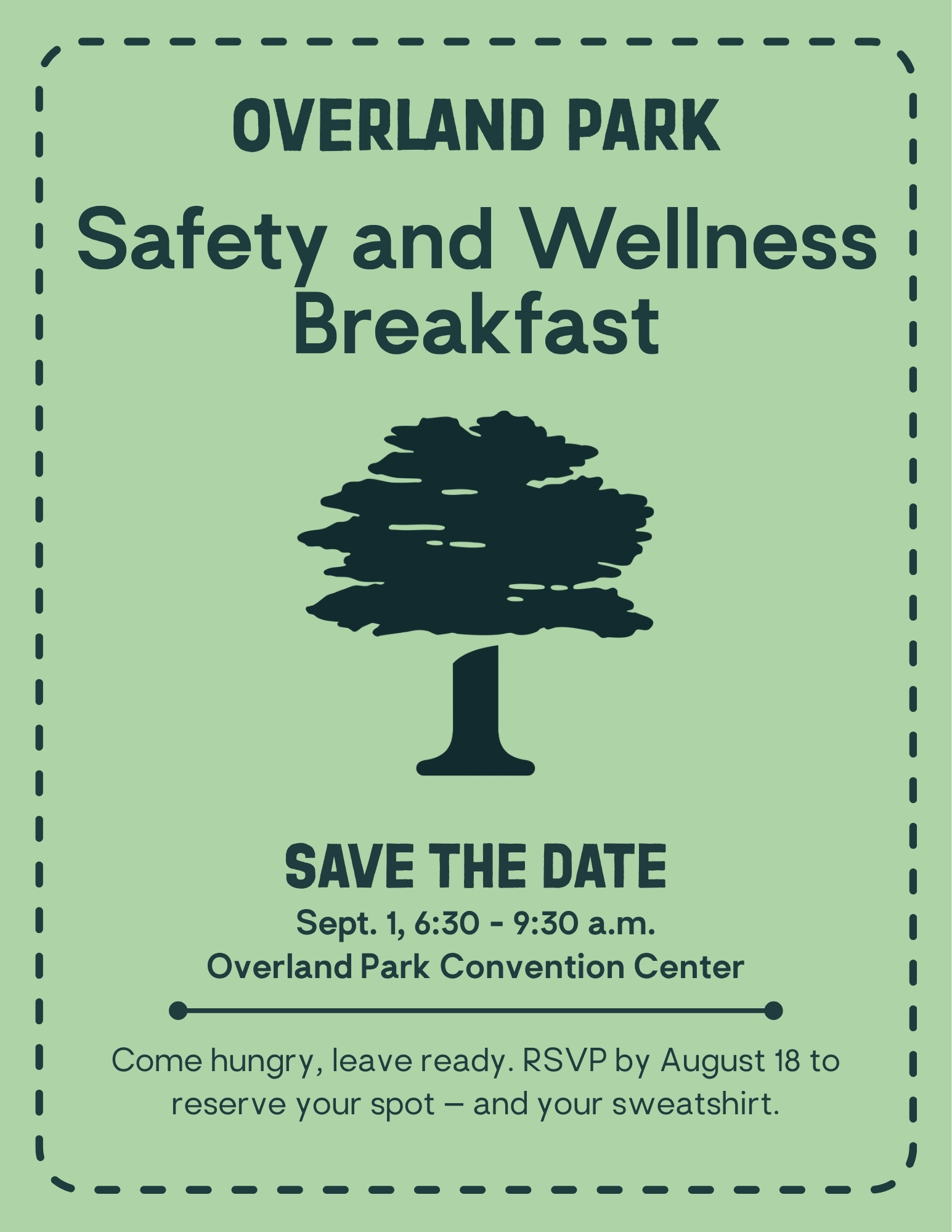
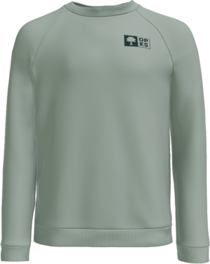
The Safety and Wellness Breakfast is an annual internal event that encourages city employees to make use of the workplace safety and wellness resources available to them. The first 600 employees to register receive a premium embroidered crewneck. I was responsible for the event’s branding, its promotional materials, and the crewneck design.
I began by reviewing the original brief and the city’s previous event designs, then chose to take the identity in a new direction. Rather than something tied to a single year, I wanted a title the city could carry forward from one year to the next. After working with our graphic designer and the wider team, we settled on the name Safety and Wellness Breakfast. From there, I built the event’s visual identity in Adobe Illustrator, testing font pairings and layouts against the city’s brand guidelines. I then produced the promotional flyer in two versions, a Canva layout for the all-employee email and a print version for display around city buildings, both designed to drive registration for the event.
Because the project had a larger-than-usual apparel budget, I had the opportunity to create something more meaningful, and treated the crewneck as something employees would genuinely want to wear rather than a disposable event giveaway. I visited a local supplier to compare product quality and chose the District Cloud Fleece Crew in Slate Green, a garment I was confident would carry the design well. They produced an embroidered sample so we could confirm it looked and printed correctly, and we made one revision before finalizing. The graphic designer approved the design, the City Manager signed off on both the design and the production cost, and the final crewneck was approved for production.
Overland Park Teen Council Apparel
A youth identity, made wearable.
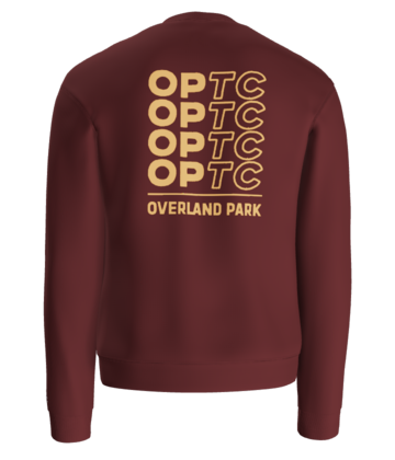
The Overland Park Teen Council gives high school students a chance to learn how local government works, exploring city departments, attending committee meetings, leading service projects, and connecting with elected leaders throughout the school year. The city needed new apparel for its roughly seventy-five members, with a request for something more colorful and youthful. We met to talk through the project, and I asked the questions that would shape the design, including the budget, the preferred colors, the type of garment, and what the group had and had not liked about past apparel. That conversation set my direction.
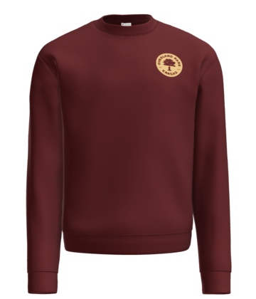
The project required several rounds of exploration before I developed a direction that fully addressed the brief and felt distinctive: a small city badge on the front-left chest paired with a larger original design on the back. I developed three refined concepts and presented them with our graphic designer to the Teen Council. When the feedback asked for more color and energy, I changed the garment color, reworked the palette, and adapted the city badge into a warmer tan colorway that tied into the back design.
For the garment, I chose a Champion crewneck that suited the audience while still meeting the City of Overland Park’s brand needs and guidelines. I visited a supplier in person to compare options and see how the print would sit on an actual shirt, since a design that looks right on a flat mockup does not always translate once it is printed. The Teen Council representative approved the revised design without further changes and described it as “awesome.”
Forest Forms Exhibit Video
Public art, built for the scroll.
Forest Forms is a public art exhibit of large-scale animal and nature sculptures spread across the Overland Park Arboretum and Botanical Gardens. I produced a short vertical video to introduce it on the city’s Instagram and Facebook. This was my first independently produced short-form video, and I handled the filming and editing using a DJI Osmo Pocket 3, with our videographer and marketing specialists advising along the way.
I spent time on the grounds capturing the sculptures from a range of distances and angles, using the camera’s stabilization to keep the movement smooth and cinematic rather than handheld. Back in Adobe Premiere Pro, I cut the footage together and shaped the pacing, adding visual and audio effects and speed changes that kept the piece moving without feeling rushed. Because it was going out on a fast-scrolling feed, every second had to earn its place, so I relied on tighter cuts and motion to hold attention from the first frame.
I built two versions with different copy for each platform. The Instagram cut is shorter and quicker, built for a fast short-form feed, while the Facebook version runs a little longer and uses lighter music, suiting an audience that tends to watch for longer and responds to a warmer, more relaxed tone. Once the edits were approved, I scheduled both through Sprout Social, wrote the captions and metadata, and worked with the marketing team to publish them. As of July 2026, the Facebook video had surpassed 10,000 views, received more than 100 likes, and generated continued engagement in the comments.
“Perfect descriptions for FOREST FORMS!!”The exhibit’s artist, in the comments